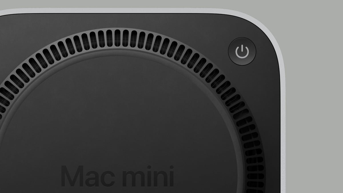
The new Mac mini, powered by the M4 chipset, was announced last month. Not only is the new M4 Mac mini arguably affordable and powerful, but it also ushered in a complete redesign for the computer. The new Mac mini is now Apple’s smallest computer ever.
However, there is one pretty controversial design choice with the new M4 Mac mini: The power button.
Previously, the Mac mini was designed with the power button located on the back of the device alongside all of the computer’s ports. With the redesigned M4 Mac mini, however, Apple placed the power button on the bottom of the device.
That’s right. The power button for the new M4 Mac mini line of computers is located underneath the device.
M4 Mac mini vs. M2 Mac mini: What are the differences?
Apple responds
Now, we have some answers regarding what Apple was thinking with the M4 Mac mini power button.
Mashable Light Speed
Credit: Apple
In an interview with IThome, Apple’s Senior Vice President of Worldwide Marketing Greg Joswiak and Senior Vice President of Hardware Engineering John Ternus addressed the location of the Mac mini’s power button.
After being asked about the design choice for the Mac mini, the Apple executives explained that it was the “optimal spot” for the power button due to the redesign. According to Apple, the new location is not inconvenient. Users can just tuck their finger underneath the computer and press the power button.
In addition, the Apple executives brought up how users don’t really utilize the power button on the Mac mini all that often.
Mashable’s take
As an owner of both the M1 Mac mini and the new M4 Pro Mac mini, I can attest to what Apple is saying. I’ve rarely had to use the power button on my old Mac mini. The most regular use for the power button was during the rare occasions where there was an issue with my computer and I had to force restart by holding the power button down. Otherwise, I’d rarely shut the Mac mini off. I just let it drift off into Sleep Mode.
As for the location of the power button on the new redesign M4 Mac minis, that’s true, too. The location of the power button is not that big of a deal. It’s still accessible for those rare occasions where I’ll need to use it.
The location of the power button has garnered so much attention, it’s reminiscent of another controversial Apple design: the Magic Mouse. Apple placed the charging port for the Magic Mouse underneath the device, meaning if you need to charge the mouse while using it, well, you’re out of luck. You can’t.
Unlike the Magic Mouse, though, the location of the power button on the Mac mini does not affect any use case scenario whatsoever.

